Partnered with stakeholders to define specific reporting and performance requirements across teams.
Created a structured design language to unify layouts, typography, and visual elements for consistency and scalability.
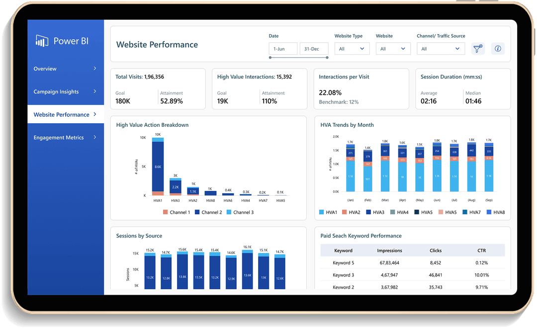
Developed wireframes and prototypes to establish intuitive layouts, clear navigation, and effective data visualization.
Ensured dashboards were user-friendly, actionable, and impactful across different user levels.
Incorporated ongoing feedback to align with evolving business priorities and improve usability.
Centralized reports reduced time spent searching across multiple data sources.
Simplified layouts and card-based structures made data easier to interpret and act upon.
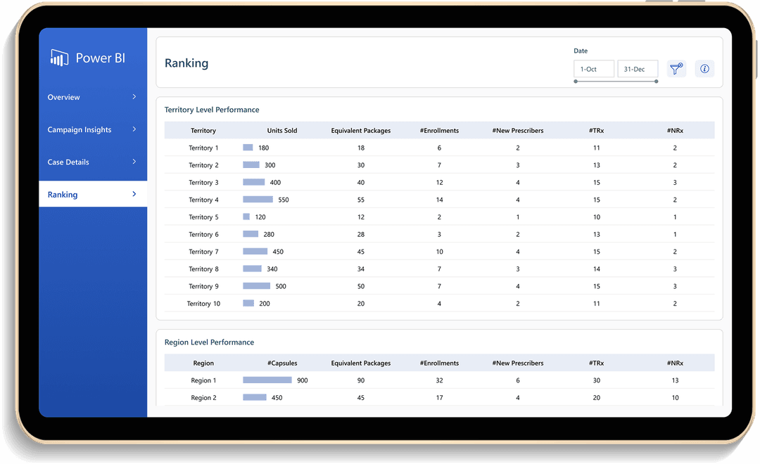
Flexible design enabled the addition of new metrics, views, and teams as organizational needs evolved.