Established core functionality with a minimal UI and static tables to ensure reliable performance and clarity in the initial design.
Introduced modern UI patterns, quick actions, and a cleaner aesthetic to simplify navigation and elevate the user experience.
Developed a dense, dark-themed dashboard with expandable sections—designed to provide a comprehensive view without overwhelming new users.
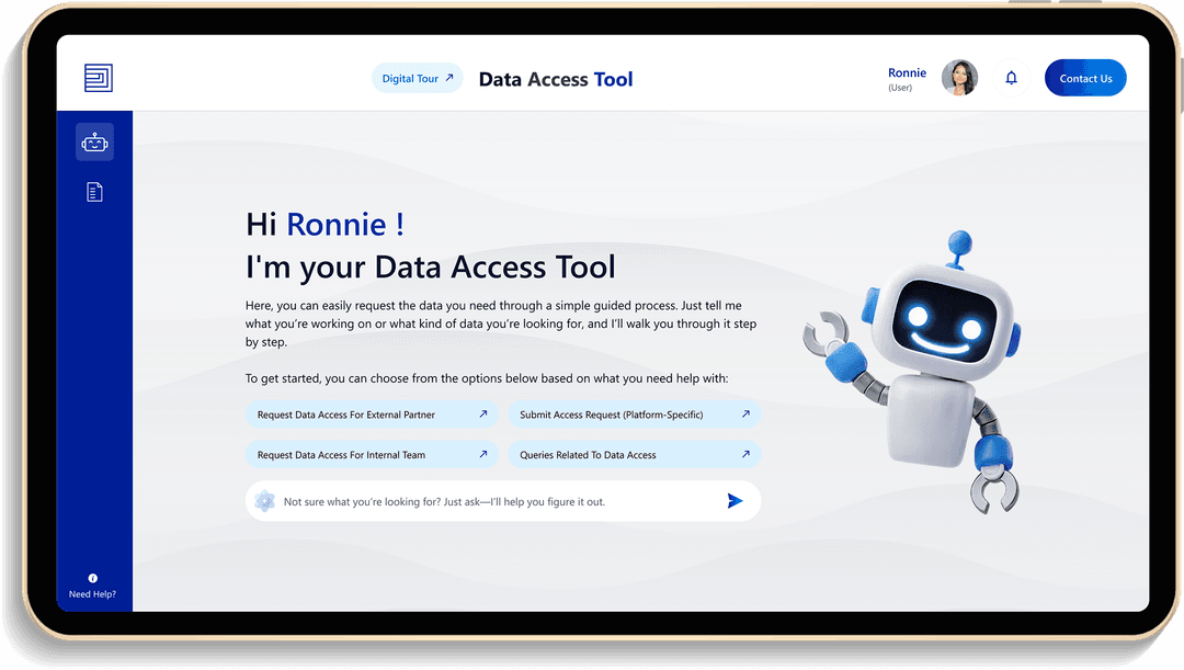
Delivered a polished interface featuring conversational flows, personalized guidance, and accessibility compliance. Added subtle animations and branded visuals to make interactions intuitive and engaging.
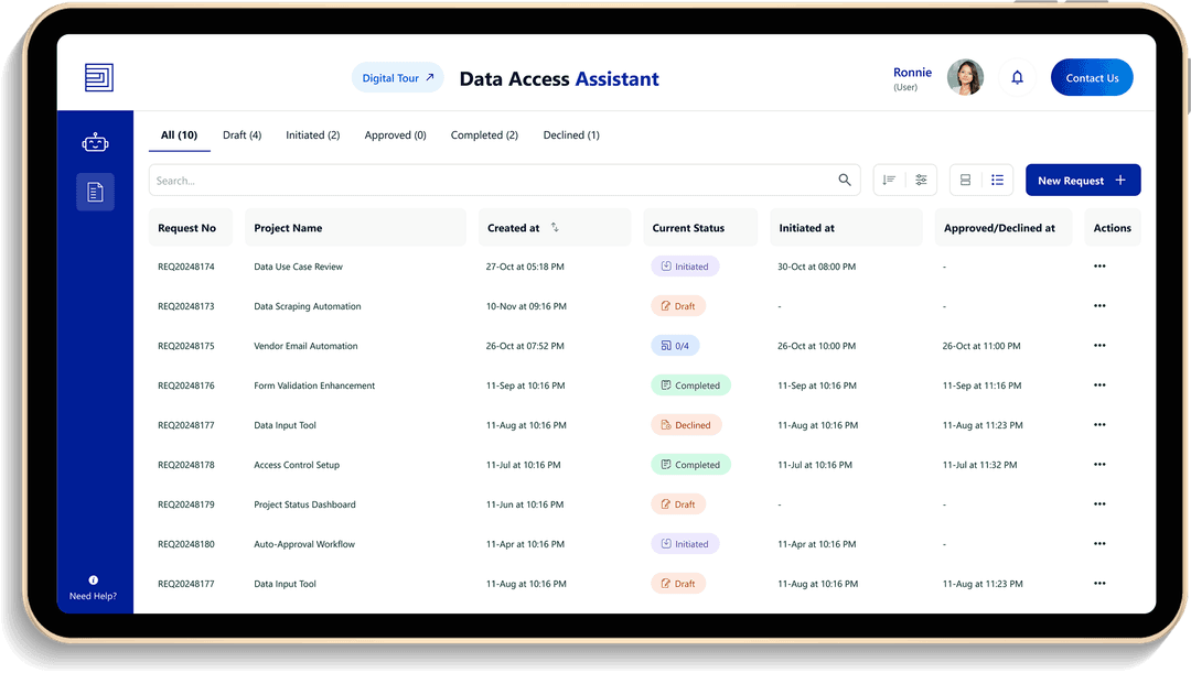
Achieved a professional, clear visual hierarchy that enhanced usability.
Ensured full compliance with AA accessibility standards for an inclusive user experience.
Conversational design elements guided diverse user roles effectively, making interactions more natural and efficient.
Inline examples and progressive disclosure reduced learning effort, making the tool easy to adopt and use from day one.